Sift recently released a data report, How Modern Companies Connect, which analyzes usage of Sift to paint a picture of how a diverse workforce utilizes a modern people directory. To build this report, we looked at 6 months of Sift usage data to discover who used our platform and how they were using it.
As someone in a product (and formerly but kind-of still engineering) role at Sift, I try to use data as much as I can to influence my decisions. I thought I had a pretty good understanding of how our customers utilized Sift. However, there were a few findings that really surprised me.
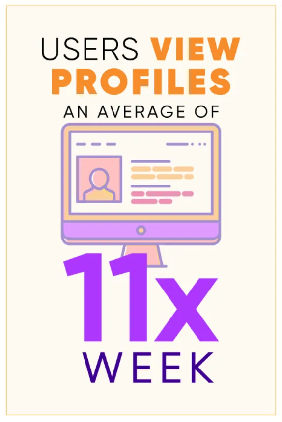
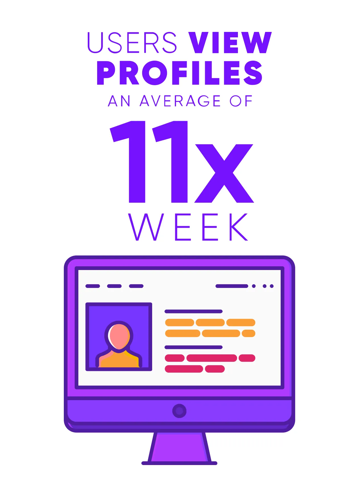
Surprise #1: Profile pages are frequently used for discovery
One of the most surprising pieces of data was just how much more often profile pages were viewed compared to other parts of our application.
What this data shows is that profile pages are not simply being used for retrieving contact information after performing a search or clicking through the org chart, but rather to discover others who are in close proximity to that person. Sort of like on Wikipedia when you can’t stop clicking on a new article to read.
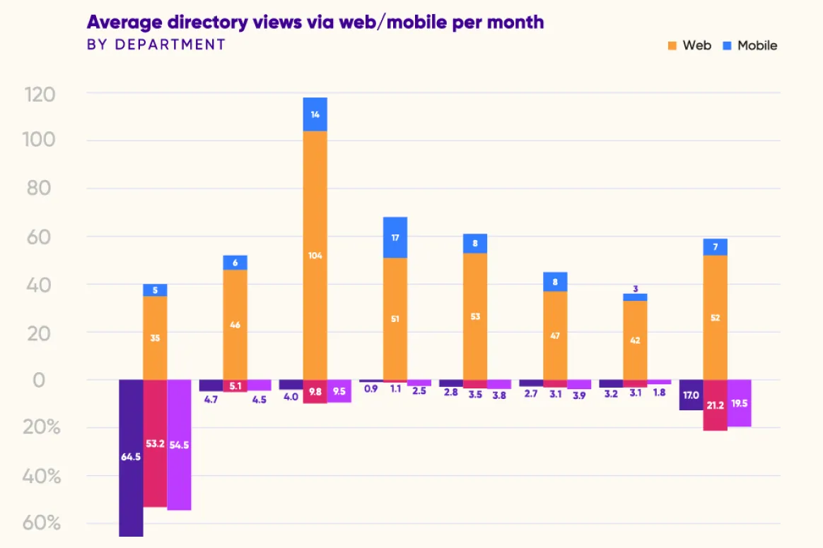
Surprise #2: Our product is truly used by all job roles
Something we’ve always used to communicate Sift’s value is the notion that it is a tool which is essential for everyone in your organization. However, logically I’ve always thought that it wouldn’t be used nearly as frequently by those who are on their feet all day, or those who may not need to connect with those outside of their immediate team. Instead, users from every department— even executives—use Sift daily.
The graph above shows average directory views via web/mobile per month, broken down by eight departments. Additionally, the figure shows the percentage of users in each department who access Sift via web vs. mobile.
One of the more intriguing data points I found was web vs. mobile usage by department. In the original data I pulled for this report, the eventual departments you see were actually made up of several smaller ones across all of our companies.
The figure above shows web/mobile screen views over the six month period for two teams. The first (orange) falls in "Operations" and the second (green) in "Sales & Service". It also looks at their overall web/mobile view ranking across all teams.
Above is an example of a couple of smaller teams, the first is made up of people who work on moving physical products through distribution centers and the second of people who do maintenance on buildings. The first couple of columns represent page views on web and mobile over the six month period, and the last two columns represent the team’s rank amongst all of those we included.
This data shows that teams such as these, that are made up of people who are frequently on their feet, still find tremendous value in our mobile application, with usage ranking above much larger departments.
Want more from Sift?
Sign up for The Forge Newsletter, a monthly round-up of the best pieces from our blog, valuable resources, and updates from the team!
Thank you! Your submission has been received!
Oops! Something went wrong while submitting the form.
Surprise #3: Users often reference previously viewed profiles and searches
There are many indicators that in addition to finding and discovering people you’re not familiar with, our users utilize Sift as a reference for those they frequently contact. One of those indicators is the high profile page use as referenced above. Another data point that didn’t make its way into the report is recent search usage.
We have an area in Sift where users can click on a recent search they performed or profile they viewed to go back to the same result. We don’t often consider this a very impactful feature, but when looking at the numbers, we discovered that these accounted for almost 10% of our search volume. Who needs to remember information when they can access it so quickly in Sift?
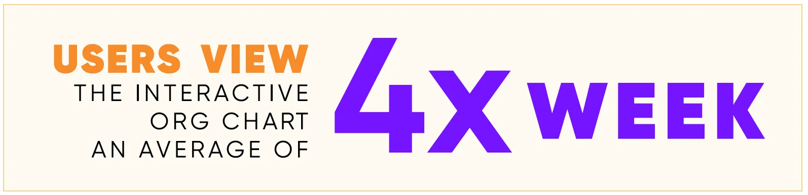
Surprise #4: Org Chart is just as popular as people search
We know that organizational charts are helpful in onboarding, but I didn’t expect to see high usage of them. The reality is that the interactive org chart functionality in Sift was utilized as frequently as people search.
After thinking about why that is, it becomes apparent that people have different learning styles and the more visual learners likely prefer to search for people using the org chart. I’ll certainly continue to watch this trend, but it definitely shows that a useful connection between the org chart and team member profiles makes the org chart extremely relevant.
See what surprises you find in the report
I highly recommend taking a look at the report if you haven't yet! It provides an in-depth look at modern people directory usage while also being very succinct. Download it below.
Going through the exercise of looking through a lot of data at once rather than consuming it more passively day-to-day has certainly provided me with perspective and inspiration on how we can continue to add value to Sift to keep companies connected and collaborative.
How Modern Companies Connect
Organizations are being pushed to become rapidly agile. For that to happen, orgs need a tool to explore the knowledge, skills, and experience of their talent, and that tool is the modern people directory. Check out this data study of six months of usage data from over 130 companies using the Sift people directory.